Whisker.com needed a more cohesive and conversion-focused product experience. As the Litter-Robot lineup expanded, shoppers struggled to compare models and move confidently toward purchase — friction was increasing alongside product complexity.
Opportunity: Simplify decision-making, create structural consistency, and design a clearer path from discovery to checkout.
Unclear hero experience
Key benefits and options were buried → needed clarity at first glance.
Inconsistent brand visuals
Pages and components varied across products → demanded a consistent brand experience.
Unproven add-on interactions
Users hesitated with optional products → tested through A/B usability validation.
Design
approach
Research-driven design with continuous validation.
We combined research, strategy, and testing to create a user-first, scalable, and clear website experience.
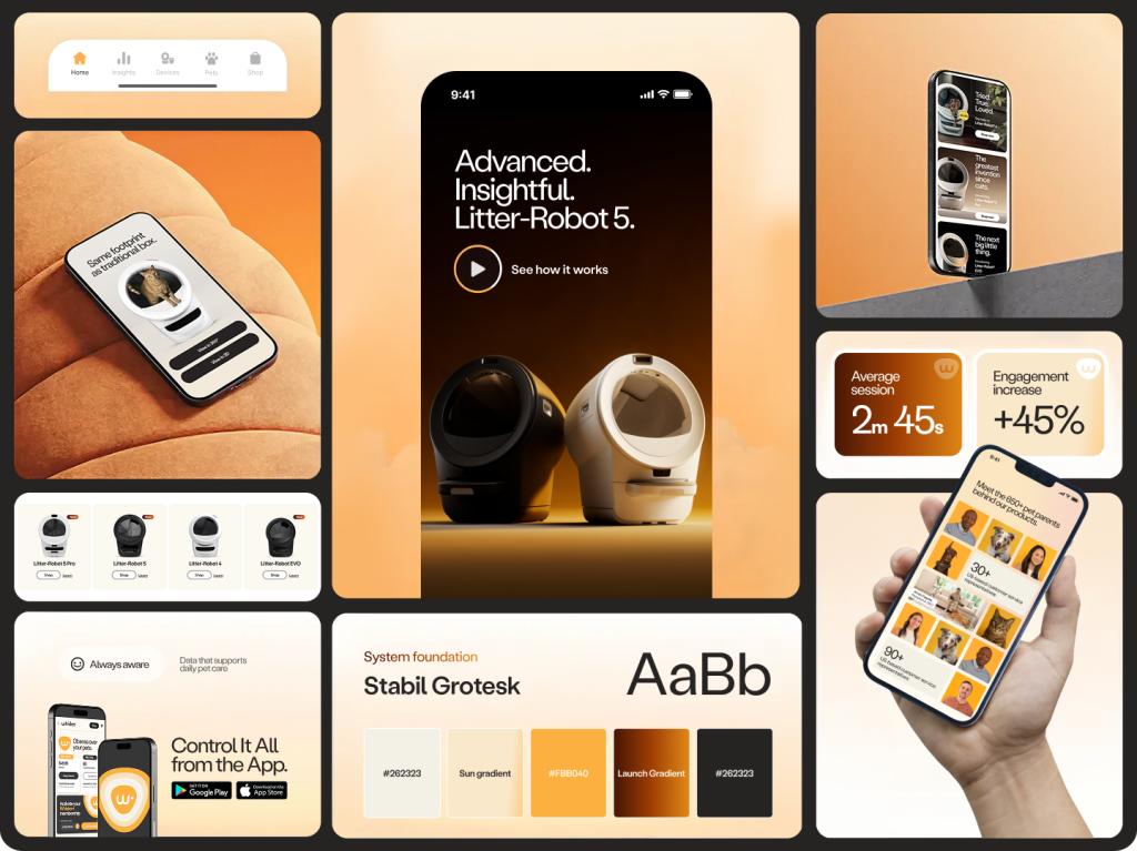
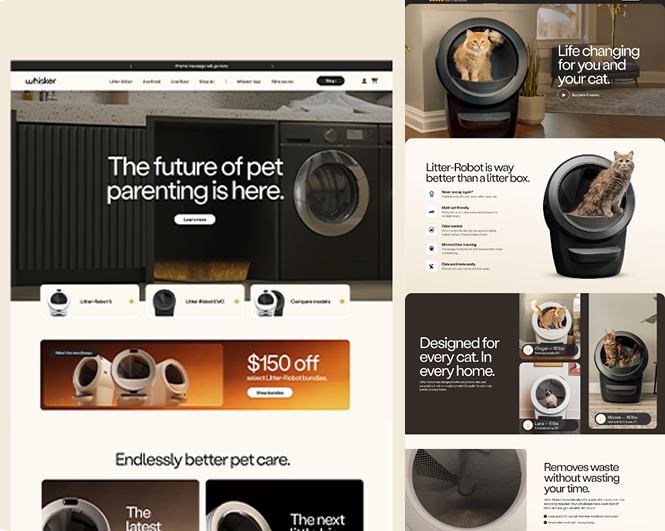
Unified robot PDP templates
Redesigned all Litter-Robot PDPs for a clear, consistent, and easy-to-compare shopping experience.
Redesigned all Litter-Robot PDPs for a clear, consistent, and easy-to-compare shopping experience.
Simple comparison chart to help shoppers choose the right product
Clarity at first glance
Designed an above-the-fold hero that clearly communicates key benefits, helping shoppers choose with confidence.
Highlights essential benefits (what problem it solves for them)
Surfaces sizes, colors, and add-ons upfront
Sticky add-to-cart button + Trust signals for confidence
Consistent brand experience
Created a modular system of fonts, colors, components, and UI states to keep the site consistent and scalable across products and campaigns.
Consistency: Pages and products follow the same design rules.
Efficiency: Developers save time while preserving clarity.
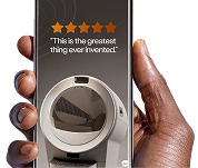
A/B usability validation
Tested three add-on designs with 70 users. Most preferred Option B, finding it clear and easy to use.
72% preferred Option B
18% frustrated by other options
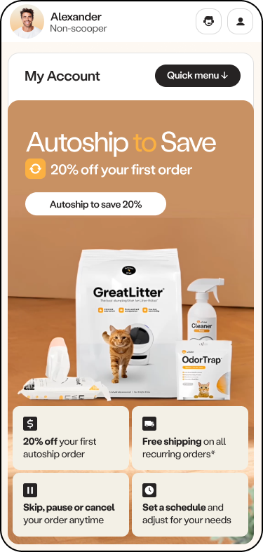
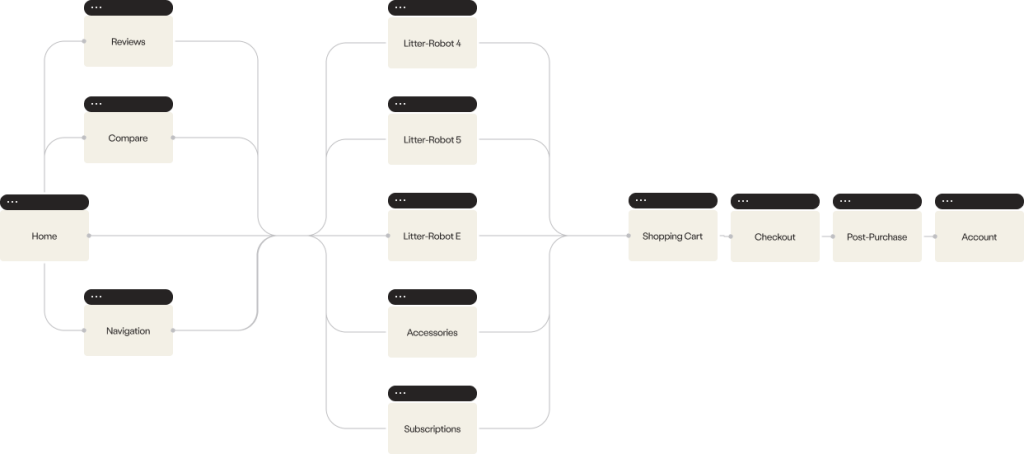
End-to-End Experience
System Applied.
Key flows redesigned across home, category, PDP, checkout, post-purchase, and account to ensure continuity and conversion.
Commit (Cart)
Confirm (Confirmation)
Return (Retention)
Shopper journey
Mindset stages.
Organized the site into three levels: exploration, decision, and commitment — to match shopper thinking and drive conversions (lower funnel)
Shopper mindset: Focused on choosing the right product. Goal: Reduce confusion, highlight benefits, encourage confident choice.
Commitment
Shopper mindset: Committing, confirming, and managing orders.Goal: Minimize friction, reassure, encourage loyalty and fast!
$
2.5m+
in sales on day one
Measured Performance
The redesign launched strong — one of the company’s highest-grossing days. Whisker.com achieved 2m45s average engagement time (+45% vs. LR.com) and a 49.6% engagement rate, indicating deeper product exploration and higher shopping confidence.
View live experience → Whisker.com
Engagement
2m45s average, 49.6% rate
Focus
Repeat visitors, high product intent
Efficiency
Modular UI, reduced rework
Impact & leadership
Helping teams move forward
Connected research, business goals, design, and development so the team could move forward together.
90%
ownership across the redesign
Led design, design strategy, resolved stakeholder conflicts, and drove alignment from concept to launch.
Ying - Lead UI/UX designer
End-to-end delivery
0 → 1
used across 60+ pages
Designed a Lego-inspired component system that lets teams update features confidently without breaking the full experience.